
BBC Weather gets updated, but is it any good?
Of all the weeks for the BBC to relaunch the weather section of their website, perhaps this wasn’t the best. A quick search of Twitter for the hashtag #uksnow will reveal the fact that there’s been a touch of snow falling in the UK this week. A quick search of any number of news sources will reveal that the touch of snow has caused widespread chaos in what claims to be a developed nation. But relaunch they did, but was it a wise move, and what’s the new site actually like to use?
Understanding your Audience
The BBC is about as mainstream as UK websites get. For some, it represents the entire internet (I know people who only visit the BBC site) in the same way the big blue e on their computer represents the internet. It’s important to remember this when considering a redesign of a site, and targetting the audience is one of the most critical aspects.
The BBC’s audience is typically resistant to change. The criticism levelled at the BBC for what I thought was a fairly decent home page redesign demonstrates this. And to bring it a little closer to the subject of this post, the barrage of complaints following the redesign of the weather maps was remarkable.
Given the relative lack of internet (and technological) experience these users exhibit, resistance to change is to be expected. To fully understand this, the significant effort involved in learning anything new has to be considered.
Timing is Everything
The above is an introduction to some of the challenges the BBC faced when considering this redesign. To counter this, the BBC went with a soft-launch, making the redesign optional to those users who wanted it. Those early adopters who were comfortable enough to experiment with new features and an unfamiliar design. This week, however, they fully rolled out the redesign, removing the old look all together.
Timing is an underrated aspect of usability. A user’s satisfaction with a redesign is directly proportionate to the amount of comfort they feel using it. e.g. how easy is it to perform set tasks, how much feedback is there, how many mistakes to the make etc. Comfortableness comes from the stress that a user feels whilst experiencing the design for the first time. Understanding this relationship is key to a successful design.
Comfort does not come from needing vital information quickly and finding that you have to learn a new interface.
I don’t blame the BBC for launching a new weather design during the worst week of weather for years, after all, plans are made far in advance of roll out dates. However, I do think they could have either extended the soft release, or offered an alternative version should users require it.
Starting off on the Wrong Foot?
 The key bit of information regarding weather is the location. You have to be able to quickly identify and provide your location, and it should be as easy as possible. The image to the left is the result of performing a search for “Bristol”. As you can see, it’s giving four results, any of which could be the actual Bristol. The Bristol I’m looking for is both close to Bath and close to Avonmouth. It’s also in the United Kingdom and may possibly be so good the BBC decided to name it twice.
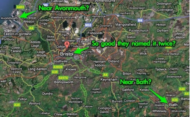 So which Bristol is it? You get similar problems when doing less specific searches, say for Cornwall. It seems as if you have to know the postcode to get an accurate result. Requiring common information in a specific format does not a happy user experience make. And we all know how important search is on sites with less experienced users.
Re-Opening Old Wounds
 When the BBC redesigned the weather maps, I really didn’t like them. Since then, they’ve been tweaked and updated, and I still don’t like them and they are carried over into this redesign. The image to the right contains the much used small icons that represent weather conditions. It’s very difficult to tell at first glance what the portrayed weather condition is unless the conditions are extreme or greatly contrasting.
 This problem isn’t limited to the small icons either. Take a look at the image to the left (click to enlarge), which is the main weather map that dominates the centre of the page. Can you tell, from looking at this image, what the weather in the area is going to be? I can’t, unless desaturated is now a type of weather condition and I missed the relevant memo. Looking further at this image and you’ll see a slider at the bottom of the map. What do you think moving the slider to the right will do? Will it zoom in, reposition the map, advance time? Who knows, there’s no label and no tool-tip.
Customisation, but not too much Customisation
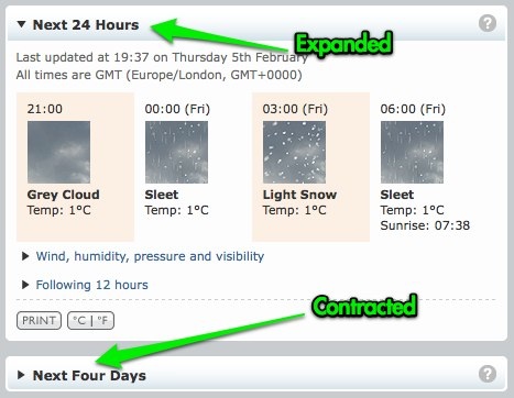 As is the trend for redesigned BBC pages, the weather site offers some customisation options. The page is split up into different sections, each of which can me expanded or contacted using a small arrow at the top of the section.
That’s all well and good, but it doesn’t go far enough. There’s some information I don’t need or want to see. And there’s some information that I want to have more prominence, but alas the content boxes aren’t movable – this is a feature we’ve come to expect of pages like this and is something the BBC does elsewhere on the site.
Introductions
 The introductory panel does an adequate job of describing the features available. However, even this isn’t perfect. Some of the phrasing is confusing, and leads less experienced users to believe they need to typing into a section heading (the orange “Search” box).
This information is also static, in that the instructions remain after you’ve followed them. This can be particularly confusing when typing a location, as the intro box still tells you to type a location even after you’ve just provided one. To exacerbate matters, the intro box appears above the fold where the actual forecast appears below the fold. The net result is that the feedback given to the user after entering a location suggests that nothing has happened. If this can confuse an experienced internet user such as myself, the less experienced internet users that frequent the BBC’s website have no chance. This intro box has to be manually cleared by the user before it disappears.
A quick browse through the links on the page also reveals that many of the help pages are yet to be updated. They seem to be suggesting that the site is still in beta, and only displayed to users who requested it.
Praise where Praise is Due
So far, this has been a fairly negative review. To me, the new weather site feels like death by a thousand paper cuts. It’s not terrible, but there are enough small annoyances to make it an unpleasant user experience. However, there are some things the BBC get right.
The integration of forecast videos is a nice touch, and the hint that there will be customisations available is promising. The BBC have also been very noble in including links to other sites, almost in acceptance of the fact that they get things wrong.
The summary feature is particularly nice, but should be given more prominence on the page. It would be a great way to introduce the page. A suggested improvement to this “plain English” interpretation of the forecast would be to make it relevant to the current / previous day’s weather. For example, tomorrow is going to be warmer than today. There are iPhone apps that do this, and it really does allow you to get a firm grasp on the weather very quickly.
Try out the new weather pages and read the documentation. What do you think? Better, or worse?

While a reasonable and inoffensive post, you’re linking to a white supremacist discussion forum… you should probably warn people they’re going to a potentially offensive site!
That aside I agree with your analysis… the redesign does fall short.
Thanks for pointing that out James, I’ve removed the link. I guess that’s what happens when you use Google to retrieve an article you’ve previously read and just trust the search results! I apologise if I caused you or anyone else offence.
Oh I think you should keep the link, the post itself is fine, maybe just warn people about the link! The same site comes up in Google not far under your own. Just worth a ‘NSFW’ kinda note next to it maybe?
Wicked article, thanks Simon. I’ve created a FaceBook group if anyone feels like a bit of online activism.
http://www.facebook.com/group.php?gid=52938723363&ref=nf
Cheers,
Mike