All Dressed Up for 2008 – Blog Re-Design Live
 After dropping hints for the last month or so, I’ve finally rolled out the new look. I’ve designed a number of blog themes over the last few years, mostly for sites I write myself and therefore run. In the past I’ve always gone with what seemed right, and didn’t really plan anything out that well. In my opinion, this lead to some unfocused designs that worked, but not quite as well as they should have.

In order to prevent this I took a different approach to this redesign. I treated myself as a formal client and drafted a list of goals for the design. I also planned my time much better and came up with some tolerances for the project. It may seem like an anal way to approach the task, but it’s greately reduced the time spent and forced me to focus more. In case you are looking at your own blog and thinking it needs to be spruced up, I’ve listed my goals below and how believe they’ve been met. And in case you are drafting in an outside to do the design, I’ve also listed the tolerances I allowed myself, a key way of making sure a design actually goes live.
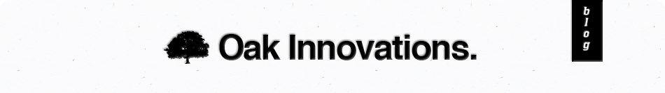
More Brandable, More Recognisable
 I wanted a site that people recognised as soon as they saw it. Something that could be associated with the site. It all comes down to branding. The approach I took was to use a recognisable symbol associated with Oaks, the Oak Leaf, and use it sparingly throughout the site. In the past I’ve used unconventional colours and Oak Trees as branding tools, each with benefits and drawbacks. I think this more subtle approach will work better.
A Proper HomePage
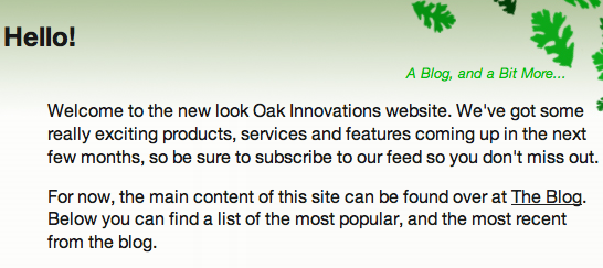 Regular readers will know that this blog is hosted in a sub directory of the domain. So to access the blog you have to go to www.oakinnovations.co.uk/blog. The root of the domain, www.oakinnovations.co.uk, has been left fairly dormant for a year or so. i really wanted to make this site more than just a blog, and bring the root of the domain back into play. So now if you go to www.oakinnovations.co.uk you will find a new page. At the moment it doesn’t contain much, only select content from the blog, but this will change over the next few weeks and months.
Highlight Popular and Active Content
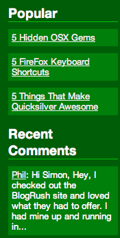 For the past few themes I’ve attempted to highlight popular and active (i.e. currently being commented on) content in an attempt to draw users deeper into the site. However, due to my lack of planning it’s often been tagged on to the end, sitting rather uncomfortably in any free space I have left after the design is complete. This time round I’ve given it prominent placement in the sidebar. I’ve also left space for me to highlight content manually, so if I start a series of posts I can add prominent links and images throughout the site.
Easy Maintenance
Believe it or not, but this is the first theme I’ve designed since WordPress introduced the Widget concept. For those who are unfamiliar with this, Widgets are pieces of functionality that can be placed into predetermined places in a theme. The beauty is that they are not static and can be moved around and edited very easily. For example, in the sidebar at the moment you will find links to recent comments, I could change this to list recent trackbacks, or recent posts, or a calendar through the WordPress Admin interface, with no need to alter the theme at all.
I’ve used Widgets a bit creatively in this new design. As well as using them in the sidebar, they are also used on the main page so I can easily add, remove and edit content.
Better Search Engine Optimisation
I’ve been wanting to tackle this area for a while. The main Search Engine friendly change I’ve made to this theme is reducing duplicate content to a minimum. The home page, the front page of the blog, category pages and tag pages only contain excerpts of posts, as opposed to the full posts. This should help out my rankings in the search engines.
To go along with this, I’ve also started utilising a number of SEO plugins for wordpress. I’ll report on them later.
No Hacks, No Conditional Code
I’m not a fan of CSS Hacks or Browser Specific code. When I weight it all up in my mind, it just seems too risky. Too many variables for my liking. So when I set out with a sketch of the new design, I was already engineering it in my head to work without hacks or browser specific code. Tied in to this is my aim for fully compliant XHTML 1.1 Strict markup, but more on this later.
Granular Requirements
I also had a number of granular, or low level requirements. There were:
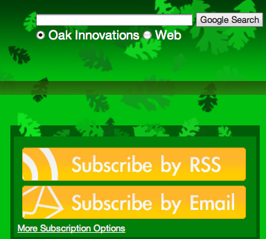
- Prominent Subscribe options. Both for RSS and Email
- Space to accomodate advertising
- More modular theme structure
- A usefull 404 page (see it here)
- Works in all major browsers
- Better readability
Tolerances
Anyone who’s worked in IT knows that every project must have agreed tolerances. Without them, an expectation arises that everything release will be faultless. Perfect. This isn’t possible, it doesn’t happen. So with that in mind I listed the things I thought may not be 100% correct at the time the site goes live. Things that will affect only a small number of users or those things which are minor to the point where they shouldn’t prevent the design being rolled out. These are:
- Tags – I’ve used a Tag Cloud in the sidebar in the knowledge that older posts will not have tags associated with them. This is a danger, but Tags are a new feature, so I’ll be playing catch up for a while.
- Browser Compatibility – In line with my view on not using hacks or specific code, I’m happy that the design does not look exactly the same in all browsers. So long as the design is functional, readable and conveys the main message of the site, I’m happy. Practically, this means that some of the spacing between page elements differs between different browsers.
- Validity – The majority of the pages on this site are valid Strict XHTML Version 1.1. This is pretty much the strictest test you can run against your theme. However, due to the way certain pieces of content on this site has been written, and problems with certain plugins, not all pages are valid. This will come in time.
- Space not being efficiently utilised – This theme is far more flexible than previous themes. Specifically the root of the site and the sidebar offer great opportunities to feature content and provide new features. At the moment, the content on the site isn’t geared up to fully take advantage of these new opportunities. Once again, this is something that will come in time.
Feed Back
I’d love your feedback on the new design. Does it work? What doesn’t and why? Would you do it differently? And are there any bugs I’ve failed to squash?
Thanks for your continued support, and I wish you all the very best in 2008!

Wow, you sure spruced up the place!
I like the new design. The only thing I’d suggest is to maybe redo the top RSS images as .gif, or a higher-quality .jpg. The current .jpg versions have noticeable artefacts in them, and look blurrier than they should. It just makes the top portion of your blog look less neat and professional, as blurry images tend to look amateurish.
Otherwise, I like it. I really like the oak leaf!
(Sorry about the tree pun; I couldn’t help it)
Thanks Caitlin. I can’t say I’d noticed any compresion Artefacts around those images, I can zoom right in and they look ok. I think it may be down to the browser and OS combination. I’ll take a look at it.
Thanks for your comment, hope you had a great politically correct holiday period and have a grand new year.